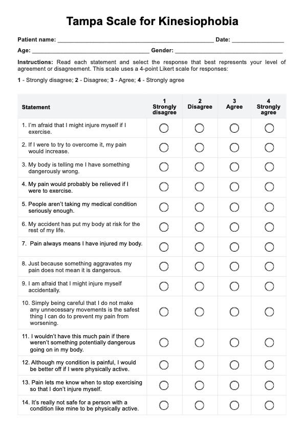
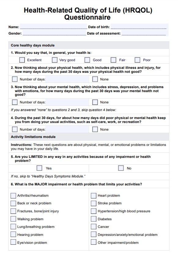
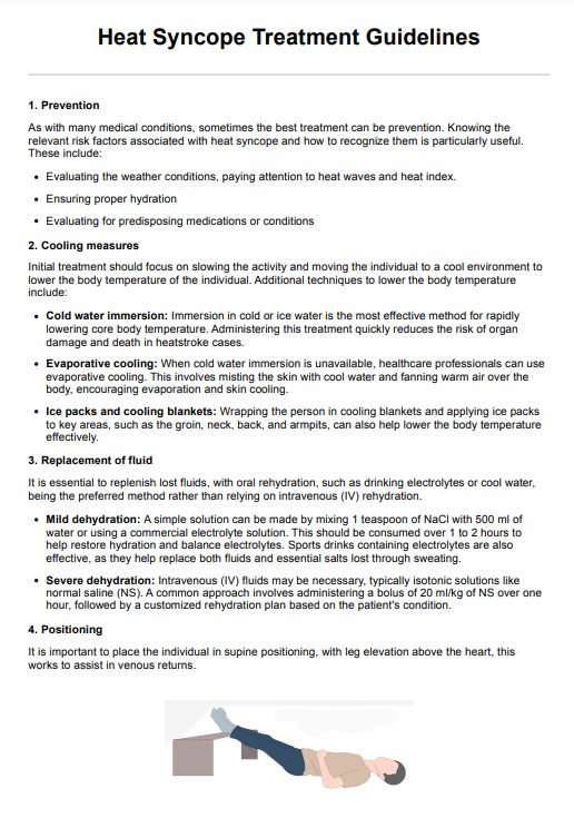
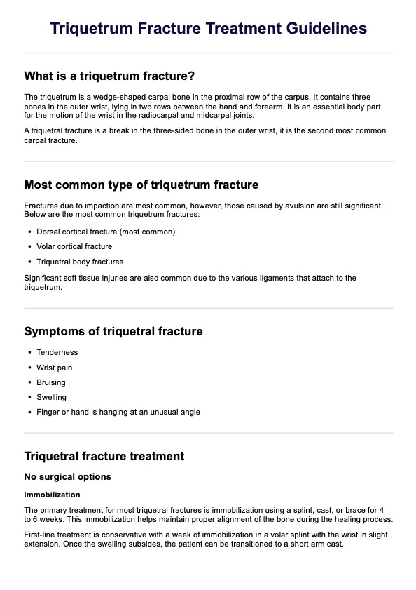
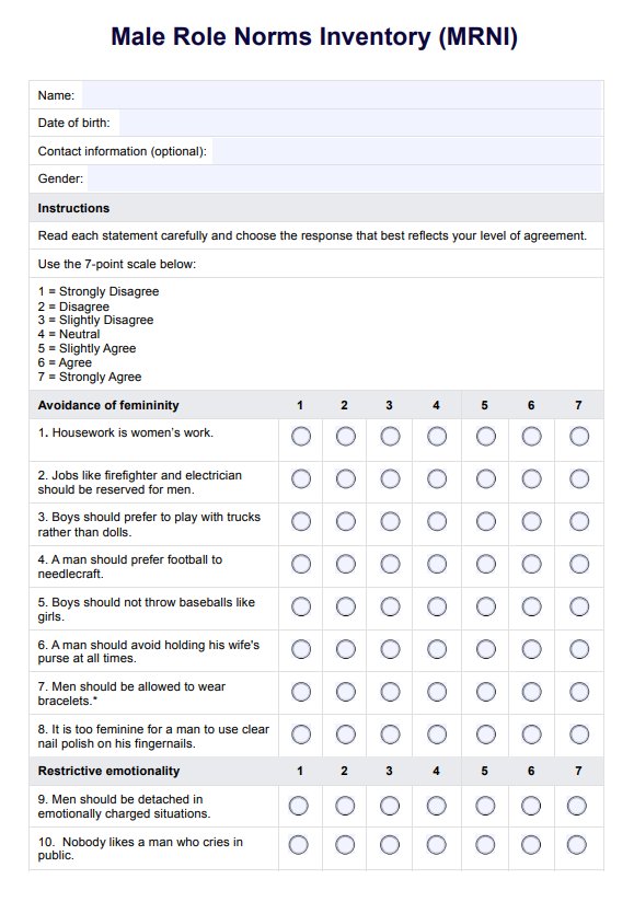
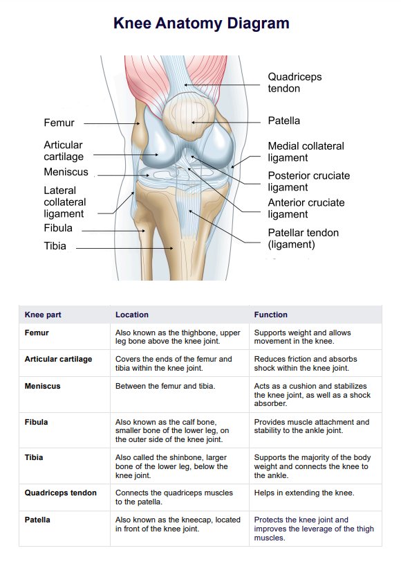
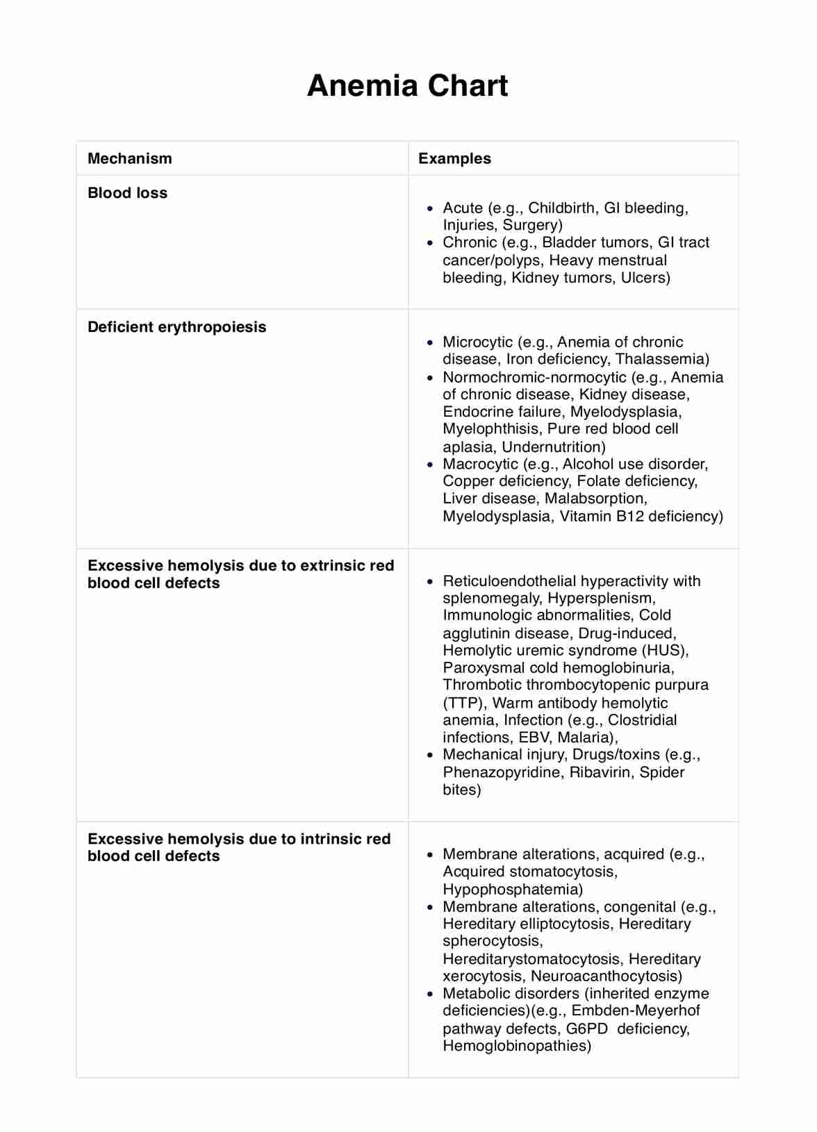
Anemia Chart
Diagnosing Anemia? Learn more about the Anemia Chart. Understand the cause and tailor treatment. Download now for precise anemia management.

Fact Checked by Ericka Pingol.


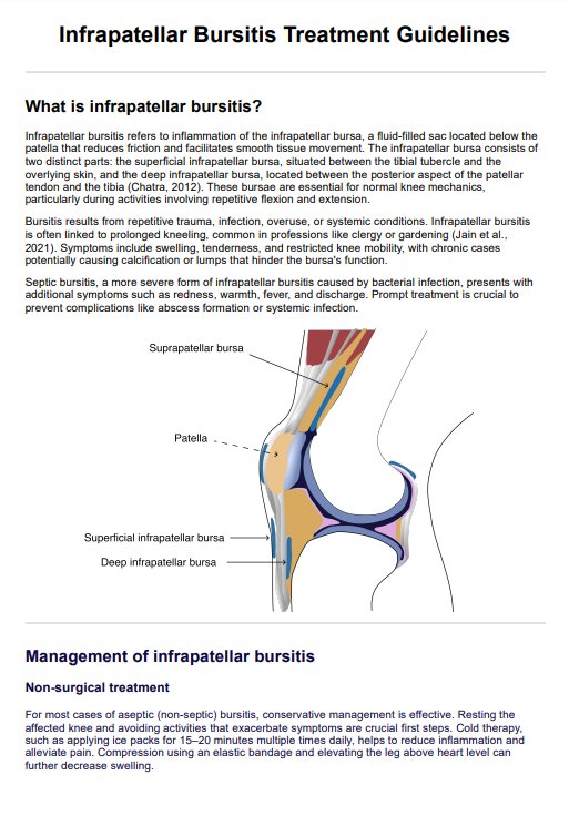
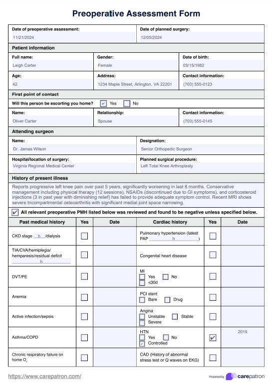
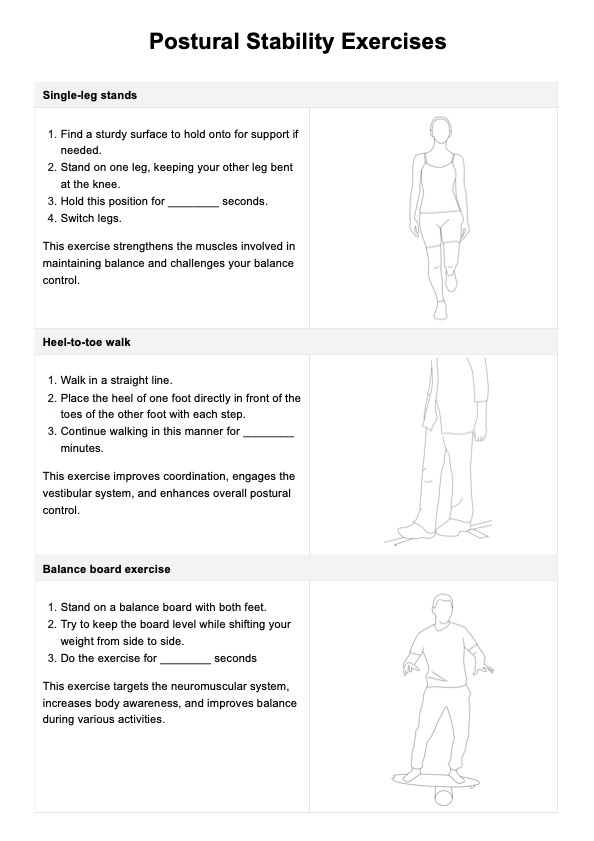
Anemia is a medical condition characterized by a deficiency of healthy red blood cells or a decrease in hemoglobin concentration in the blood, which can result in reduced oxygen-carrying capacity. It often leads to symptoms such as fatigue, weakness, and paleness, as well as potential complications affecting various organ systems. Healthcare professionals use an essential resource known as an Anemia Chart to effectively diagnose and manage anemia.
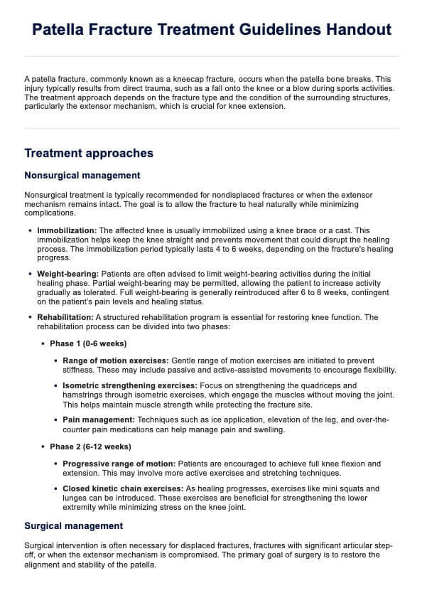
Anemia Chart Template
Anemia Chart Example

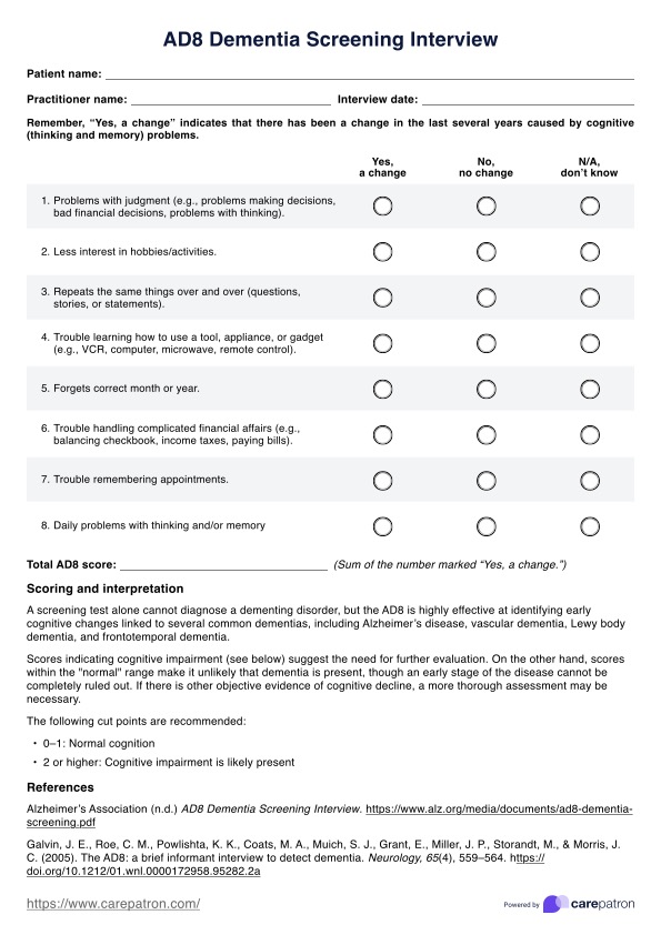
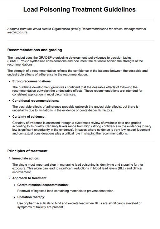
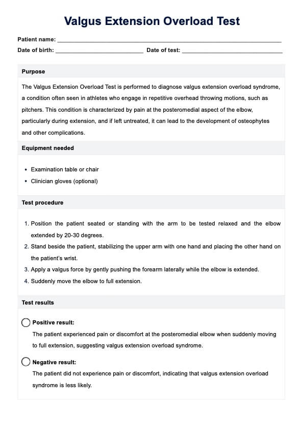
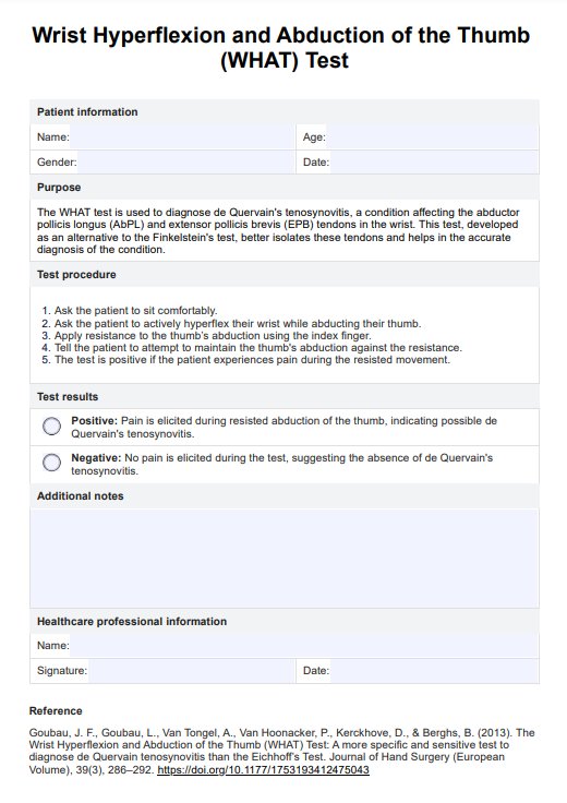
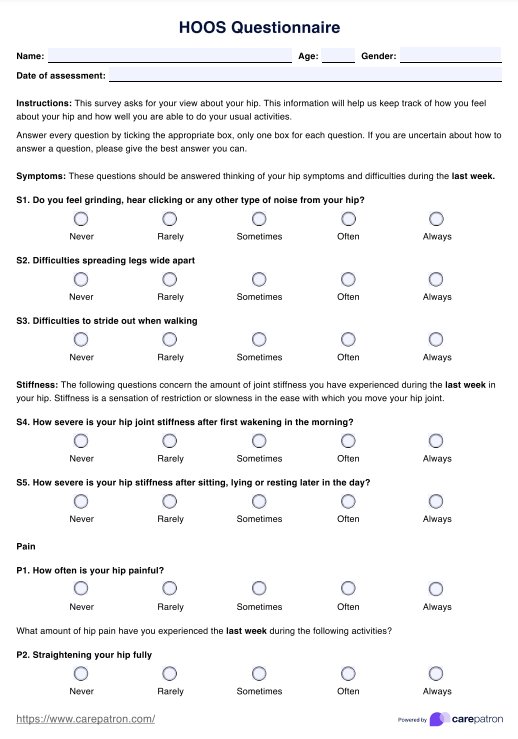
How does our template work?
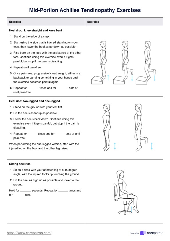
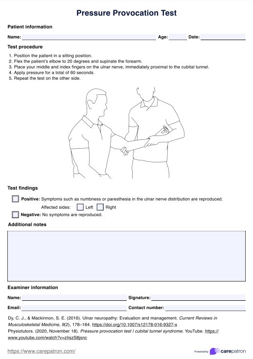
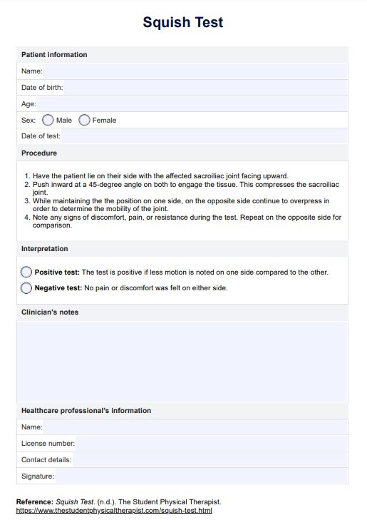
Here are five steps on how to use this printable Anemia Chart:
Step 1: Chart review
Review the Anemia Chart to identify the specific mechanism causing anemia in the patient. Understand the different mechanisms, such as blood loss, deficient erythropoiesis, and excessive hemolysis due to extrinsic or intrinsic red blood cell defects. Hemolytic anemia is one mechanism that can be identified using the Anemia Chart.
Step 2: Red blood cells mechanism identification
Match the patient’s clinical presentation and test results with the appropriate mechanism on the chart. Determine if the anemia is related to acute or chronic blood loss, erythropoiesis, or hemolysis problems like sickle cell anemia, a type of inherited hemolytic anemia and the most common form of sickle cell disease.
Step 3: Recording mechanism & fill in the interpretation
Record the mechanism and relevant examples in the “Results & Interpretation” section. Be specific about the mechanism and its potential causes based on your assessment. Meanwhile, you can also provide a concise summary of the anemia’s underlying cause and possible implications for the patient’s health.
Step 4: Add recommendations
Use the “Comments and Additional Notes” section to offer recommendations for further diagnostic tests, treatment options, or lifestyle modifications tailored to the specific mechanism identified in the chart. Ensure the patient’s unique circumstances are considered for a comprehensive care plan.
What do the mechanisms mean?
Interpreting the results obtained using the free Anemia Chart is crucial for healthcare professionals. Common results and implications can provide valuable insights into a patient’s health.
Blood loss
If the chart indicates blood loss as the mechanism, it typically means the anemia is due to acute or chronic bleeding, which may require further investigation to pinpoint the source.
Deficient erythropoiesis
This result often points to issues like thalassemia, nutritional problems, or iron deficiency anemia. If normochromic-normocytic anemia is indicated, it could be due to chronic diseases, kidney issues, or aplastic anemia, a rare bone marrow failure disorder. Macrocytic anemia may suggest alcohol misuse or folic acid deficiency.
Excessive hemolysis due to extrinsic or intrinsic factors
Excessive hemolysis due to extrinsic factors could indicate autoimmune diseases, infections, or drug-related complications.
Intrinsic factors causing excessive hemolysis may be associated with inherited conditions, such as hereditary spherocytosis or enzyme deficiencies.
Note that hemoglobin levels are often measured in grams per deciliter (g/dL) to assess the severity of anemia.
Healthcare providers must understand these common results and what they mean because they guide the diagnostic and treatment process. Once they receive the specific mechanism is identified, it helps select the most appropriate tests, interventions, and therapies to address the underlying cause of anemia.
When to use this chart?
The Anemia Chart is a valuable resource primarily designed for healthcare practitioners, including doctors, nurses, and hematologists, to use when they encounter patients presenting with symptoms of anemia. It’s an essential tool healthcare professionals use to accurately diagnose, manage, and eventually treat anemia.
Healthcare professionals should consider using the Anemia Chart when patients exhibit signs such as fatigue, pallor, shortness of breath, or other symptoms indicative of anemia. This chart is especially helpful when it’s necessary to classify anemia based on its underlying mechanism.
The Anemia Chart is beneficial for identifying the potential causes of a patient’s anemia, such as blood loss, deficient erythropoiesis, excessive hemolysis, or chronic disease, such as chronic kidney disease.
This offers a systematic approach to categorization. It helps healthcare providers decide which diagnostic tests or treatments, like iron supplements or blood transfusions, are most appropriate for the specific type of anemia.
Therefore, it should be used during patient assessments and in cases where anemia is suspected. It provides a structured and efficient means of reaching a more accurate diagnosis and tailoring treatment strategies accordingly.
Commonly asked questions
Healthcare professionals, such as doctors, nurses, and hematologists, typically request an Anemia Chart when assessing patients with suspected anemia.
Anemia Charts are used during patient assessments to classify and determine the underlying causes of anemia, guiding diagnosis and treatment decisions.
These charts are used by healthcare providers as a reference tool to categorize and manage anemia cases, assisting in tailoring treatment plans.
The time taken to complete an Anemia Chart depends on the complexity of the case and the practitioner's familiarity with the chart; it can vary from a few minutes to longer, more detailed assessments.
Related Templates

Popular Templates