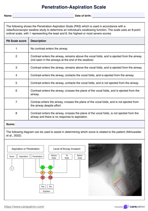
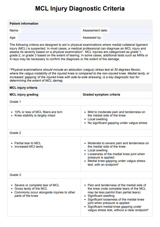
HGB Levels
Optimize your health with our comprehensive HGB Levels Chart, offering insights into hemoglobin levels for effective healthcare management.

Fact Checked by Ericka Pingol.
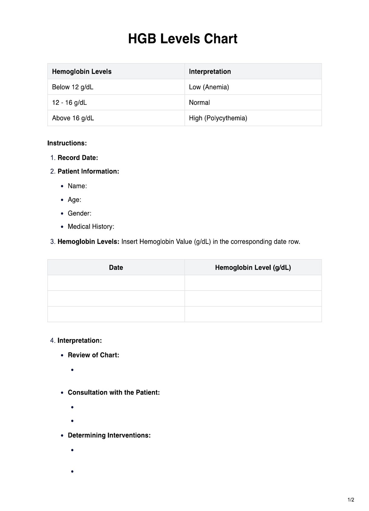


What is an HGB Levels Chart?
A HGB Levels Chart is a valuable resource for healthcare practitioners and caregivers, visually representing hemoglobin levels in the blood. Hemoglobin, a protein in red blood cells, is crucial in transporting oxygen from the lungs to the rest of the body.
This chart is a quick reference guide, displaying normal and abnormal hemoglobin levels. It empowers healthcare professionals to assess a patient's oxygen-carrying capacity, diagnosing and managing various conditions such as anemia, polycythemia, and pulmonary diseases.
Carepatron recognizes the significance of this tool in streamlining patient care. The HGB Levels Chart on Carepatron's platform is designed to be user-friendly and accessible, ensuring that healthcare practitioners can effortlessly interpret and communicate hemoglobin data with their patients. The chart is a visual aid during consultations, fostering clear communication and understanding between practitioners and their patients.
Its comprehensive healthcare management platform integration sets Carepatron's HGB Levels Chart apart. It seamlessly connects with other patient data, allowing practitioners to track trends over time, identify correlations with symptoms, and make informed decisions about treatment plans. This dynamic approach enhances the overall quality of patient care, aligning with Carepatron's commitment to fostering efficiency and collaboration within the healthcare ecosystem.
In conclusion, the HGB Levels Chart on Carepatron is not just a static reference tool but a dynamic resource that contributes to a holistic approach to patient care, reflecting the platform's dedication to innovation and excellence in healthcare management.
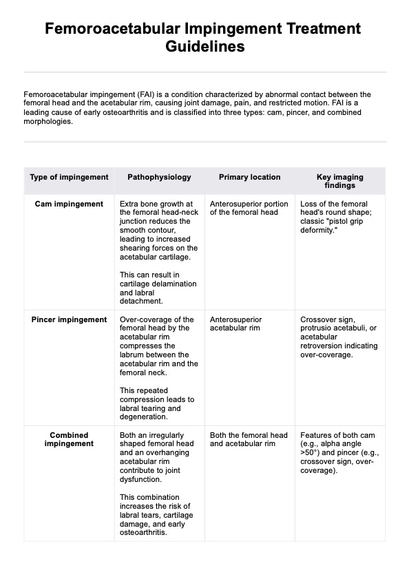
HGB Levels Template
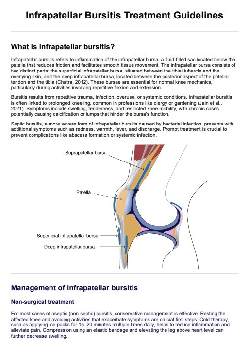
HGB Levels Example
How Does It Work?
The Printable HGB Levels Chart is a straightforward yet powerful tool that healthcare practitioners can employ to monitor and manage hemoglobin levels in their patients. Here's a concise guide on how it works:
Download and Print:
Begin by downloading the Printable HGB Levels Chart, readily available in a user-friendly format on the Carepatron platform. Once downloaded, print the chart to have a physical copy for easy documentation.
Patient Information:
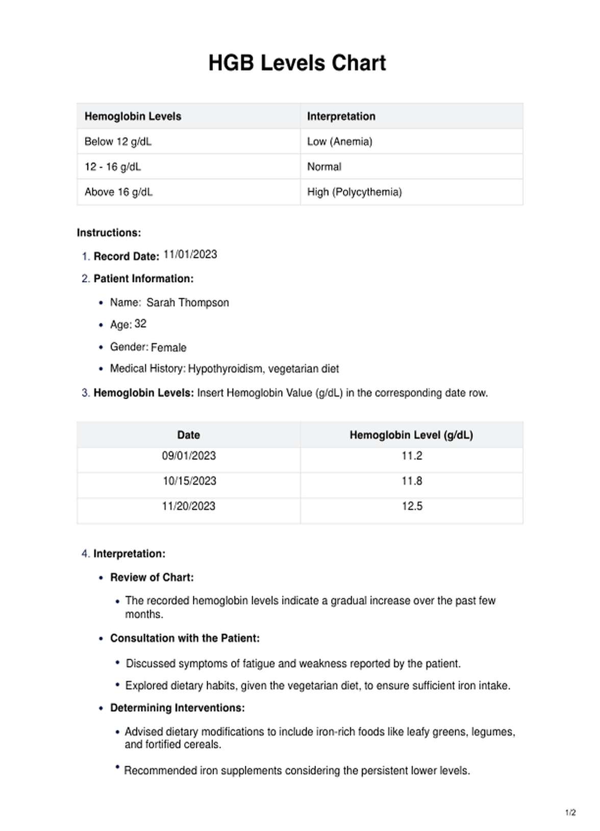
Enter essential patient details at the top of the form, including the patient's name, age, gender, and pertinent medical history. This information lays the foundation for a contextualized assessment.
Record Dates and Hemoglobin Levels:
In the designated rows, input the date of each assessment alongside the corresponding hemoglobin level in grams per deciliter (g/dL). This allows for a chronological overview of the patient's hemoglobin fluctuations.
Interpretation Section:
The chart's interpretation section is color-coded for quick analysis. Hemoglobin levels below 12 g/dL are coded in red, indicating low levels (potentially indicative of anemia), while levels between 12 and 16 g/dL are coded in green, signifying normal values. High levels above 16 g/dL, possibly suggesting polycythemia, are coded in blue.
Consultation and Decision-Making:
Regularly review the chart during patient consultations to identify trends and patterns. Engage in open discussions with patients about their symptoms and lifestyle factors. Based on the chart's insights, make informed decisions regarding dietary recommendations, lifestyle adjustments, or additional medical interventions.
Follow-Up and Adjustment:
Schedule follow-up assessments to track the effectiveness of interventions and adjust the care plan accordingly. The chart's visual representation facilitates clear communication between healthcare practitioners and their patients, fostering a collaborative approach to healthcare management.
In essence, the Printable HGB Levels Chart streamlines the monitoring of hemoglobin levels, providing a tangible and organized way for healthcare practitioners to track, interpret, and respond to changes over time. Its simplicity and integration into the Carepatron platform enhance the efficiency and effectiveness of patient care.
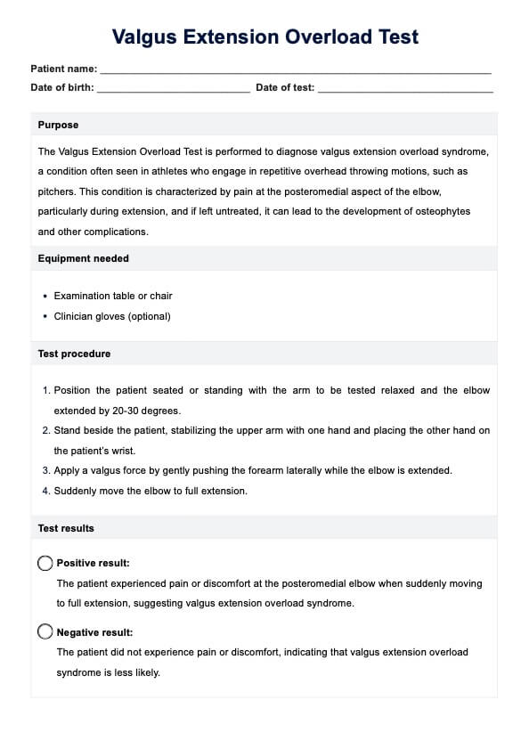
When Would You Use This Chart?
The HGB Levels Chart is an invaluable resource for healthcare practitioners, particularly physicians, nurses, and hematologists, as it aids in systematically monitoring and managing hemoglobin levels in diverse clinical scenarios.
1. Routine Check-ups:
Incorporate the HGB Levels Chart into routine check-ups to assess a patient's health comprehensively. It provides a quick visual representation of hemoglobin levels, enabling practitioners to identify potential issues promptly.
2. Anemia Diagnosis and Management:
For practitioners focused on hematology, the chart becomes a pivotal tool in diagnosing and managing anemia. By consistently tracking hemoglobin levels over time, healthcare professionals can discern patterns and tailor interventions to address anemia's specific type and severity.
3. Chronic Disease Management:
Physicians managing chronic conditions such as chronic kidney disease, where anemia is a common comorbidity, can utilize the HGB Levels Chart to monitor the impact of treatments and adjust management plans accordingly.
4. Pre-operative Assessments:
Surgeons and anesthesiologists can employ the chart as part of pre-operative assessments to ensure optimal oxygen-carrying capacity. This aids in preemptively addressing any underlying hemoglobin issues that might pose risks during surgery.
5. Oncology Care:
Oncologists tracking patients undergoing cancer treatments, which can impact hemoglobin levels, benefit from the chart. It assists in tailoring supportive care measures and ensuring patients maintain adequate hemoglobin levels for optimal well-being.
6. Primary Care and General Practitioners:
General practitioners can seamlessly integrate the HGB Levels Chart into routine primary care, enhancing their ability to detect early signs of abnormalities and provide timely interventions or referrals as needed.
The HGB Levels Chart is versatile, fitting seamlessly into many medical contexts and aiding practitioners in diverse specialties. Its user-friendly design and integration into the Carepatron platform make it a practical and accessible tool for healthcare professionals striving for efficient and collaborative patient care.
What do the Results Mean?
Interpreting the Free HGB Levels Chart results is crucial for healthcare practitioners to make informed decisions about a patient's health. The chart categorizes hemoglobin levels into three distinct ranges: below 12 g/dL, 12-16 g/dL, and above 16 g/dL, each associated with specific implications.
1. Below 12 g/dL (Low):
Hemoglobin levels below 12 g/dL typically indicate low levels, suggesting a potential diagnosis of anemia. This could result from various factors such as nutritional deficiencies, chronic diseases, or bone marrow issues. Symptoms may include fatigue, weakness, and shortness of breath. Further investigation and intervention are crucial to identify the underlying cause and implement a targeted treatment plan, including dietary changes, iron supplements, or addressing contributing health conditions.
2. 12-16 g/dL (Normal):
Hemoglobin levels within this range are considered normal, reflecting an adequate oxygen-carrying capacity in the blood. Normal levels contribute to overall well-being, and patients within this range usually exhibit no symptoms associated with anemia or polycythemia. Regular monitoring is advisable to track any subtle fluctuations and maintain optimal health.
3. Above 16 g/dL (High):
Hemoglobin levels exceeding 16 g/dL may signal high levels, indicative of conditions like polycythemia. This may result from chronic hypoxia, certain tumors, or bone marrow disorders. While symptoms may not be immediately evident, long-term complications like increased blood viscosity and clotting risks can arise. Consultation with specialists, such as hematologists, is essential to determine the cause and establish an appropriate management plan.
The Free HGB Levels Chart is a valuable tool for practitioners to assess a patient's hemoglobin status quickly. Understanding the implications of results within the context of these three ranges allows for targeted interventions, promoting proactive healthcare management and patient well-being. Regularly utilizing this chart and its integration into the Carepatron platform fosters a comprehensive and collaborative approach to patient care.
Research & Evidence
The HGB Levels Chart has a rich history supported by extensive research, evolving alongside advancements in healthcare. One seminal study, "Hemoglobin and Hematocrit Levels in Adults: United States, 1988–1994," conducted by the National Center for Health Statistics, underlines the importance of understanding hemoglobin levels in the adult population (Centers for Disease Control and Prevention [CDC], 2009).
Research on hemoglobin's role in oxygen transport dates back to the early 20th century. The work of Haldane and Priestley on oxygen dissociation curves laid the foundation for comprehending the intricate relationship between hemoglobin and oxygen saturation (Haldane, 1914; Priestley, 1914).
The use of hemoglobin levels as a diagnostic tool gained prominence in the mid-20th century with the advent of automated blood analyzers. The study by Crosby and Furth (1955) marked a pivotal moment in incorporating these technologies into routine clinical practice, providing a standardized and efficient means of measuring hemoglobin levels (Crosby & Furth, 1955).
Recent research, such as the meta-analysis conducted by Leal et al. (2021), emphasizes the significance of monitoring hemoglobin levels in various clinical contexts, including managing anemia in chronic kidney disease patients (Leal et al., 2021).
The HGB Levels Chart, as a tangible representation of these cumulative research efforts, serves as a practical tool for healthcare practitioners. Its integration into platforms like Carepatron aligns with contemporary healthcare practices, leveraging technological advancements to enhance patient care through efficient data management and collaborative decision-making.
References
Centers for Disease Control and Prevention (CDC). (2009). Hemoglobin and Hematocrit Levels in Adults: United States, 1988–1994. National Center for Health Statistics.
Crosby, W. H., & Furth, F. W. (1955). Standardizing a Method for Clinical Hemoglobinometry—An Appraisal of the Shalk and Lee Method. New England Journal of Medicine, 252(1), 35–39.
Haldane, J. S. (1914). The Relation of the Action of Hemoglobin to the Acid-Base Balance of the Blood. Proceedings of the Royal Society of London. Series B, Containing Papers of a Biological Character, 87(594), 570–574.
Leal, A., Fidalgo, P., Esgalhado, M., & Santos, J. (2021). Anemia in chronic kidney disease: An integrative review. International Journal of Nursing Knowledge, 32(1), 3–13. https://doi.org/10.1111/2047-3095.12237
Priestley, J. (1914). The dissociation of oxyhemoglobin. Journal of Physiology, 48(5), 438–438.
Commonly asked questions
Monitoring hemoglobin is crucial for assessing overall health. Abnormalities in hemoglobin levels can indicate conditions such as anemia or polycythemia, providing insights into a patient's well-being.
The frequency of hemoglobin level checks depends on the individual's health and medical history. Generally, routine check-ups may include hemoglobin assessments, especially for those with known risk factors or conditions.
Color-coded ranges on the chart indicate the interpretation of hemoglobin levels. For instance, red may represent low levels (indicative of anemia), green for normal levels, and blue for high levels (suggestive of polycythemia).
Related Templates

Popular Templates